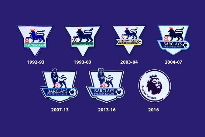
The Premier League Logo Design is a very well-known lion mascot logo with a purple background. It’s associated with the best league in football, and the best-gathered players you can imagine.
Every match, thousands of fans come together to watch the premiership matches. However, that wasn’t always the case.
While English football clubs gained an incredible amount of achievements in all kinds of European championships, the passion for football seemed to settle around the ’80s.
Where stadiums and sports grounds had gotten abandoned, football hooliganism started. Eventually, this got so out of hand that the English clubs got banned from participating in the European championships.
As you may imagine, this wasn’t a pleasant time for them.
When did the Premier League logo rise?
After all the disqualifications, the talented sports players decided to leave the country. To stabilize this situation, the British government had to take various actions. Eventually, stadium renovations began, and each of them got newly installed seats. While the government spent millions on this, it did help to keep the riots in check.
After the upgrades, there was an increase in match visitations, and slowly but surely, football became a profitable business again.
However, there was still a need for change. That’s why the organizations decided to create a new league. This event is now known as the beginning of the Premier League.
Still, the premier league needed new Premier League team logos. They ended up choosing a roaring lion.
After time went by, the logo wasn’t as impressive as it used to be. The color combinations of blue, red, and green didn’t work well together, and the lion had barely any purpose. While it was a powerful image when it started, it was time for a change.
The meaning and evolution of the Premier League Logo Design
The choice to use a lion logo design was a deliberate one. The lion is a symbol for British Football and has been since 1872. It stands for the royal connection as a lion is the king of the animals. Being a powerful organization, the Premier League could afford such a royal symbol in their EPL logo design.
In 1996, the league got a new logo design. This time, however, it seemed that the model had gotten worse.
The lions’ expression remained, but he got a ball as an extra accessory. The Premier League badges looked like a children’s’ themed design. The colors didn’t match, the fonts looked off, and a thick, black line surrounded the whole design.
Fortunately, the designers quickly realized their mistakes and started planning a new design. After trying multiple times, they released a new logo design in 2007.
This premier league logo was the best one yet. The lion looks elegant and with status. As a bonus: the image is minimalistic, yet royal. It’s the perfect combination!
The Premier League font
The current, and possibly final, version of the logo shows a greater sense of harmony. The royal purple color shows authority and riches.
The font used in the design is ‘Radical Bold’ with some slight alterations. In combination with the simple image, this gives off a sense of power, resilience, and nobility. They battled through hard times, and it shows.
The premier league has had a significant variation of premier league logo designs over the years, but their mentality remained the same. By carrying on, you will make it!


