The secret ingredient to gaining customers is by having the best restaurant logo design. When you own a restaurant, the best way to keep customers coming back is through great hospitality and incredible food. However, you need to get them through the door first, and how do you do that?
Well, effective logo design makes your restaurant stand out from the crowd. A well-designed restaurant logo will make sure your customers will remember your restaurant as soon as they see your logo. It may even cause a discussion or recommendation on social media. It doesn’t matter what kind of food and drinks you serve when your logo matches your food and personality; people will remember you. Today, we’re going to have a look at multiple restaurant logo designs that will inspire your creativity!
Table of Contents
How to create a good restaurant logo
When you are planning on designing a trademark for your establishment, you need to take multiple factors into account: location, style, personality, type of dishes, and your customers.
Award-winning Italian-American graphic designer Louise Fili specializes in food packaging for brand development. She states that answering all the above factors is incredibly important as it gives you something to hold on to. It’s all about knowing what you don’t know. It doesn’t matter how far along you are. It gives you a place to start.
Want an awesome logo design?
Work with our team to create an restaurant logo today!
Start by writing down all the pieces in your restaurant that give it its personality. Think of the cuisine you serve, the region, prices, decór, and atmosphere. Try to find ways in which design elements can improve that.
To give you a visual, many modern establishments use bold graphics. However, if you own a more traditional or laid-back store, they may not fit so well. You also need to make sure that your personality stays consistent throughout your whole design.
The purpose of your trademark is that it brings in new customers, but that it also draws back familiar faces. So, your next step is to identify your target audience. What’s their age? How much are they willing to spend? What will your audience be looking for in your restaurant visuals? If you already have a few customers, ask them what you could improve. That way, you have valuable input, and they will feel like you hear them.
Another thing to keep in mind is the way your logo will look on the outdoor sign in front of your restaurant. It needs to look good on smaller and bigger prints, especially the fonts and colors.
Restaurant Logo Design Inspiration
Upscale Establishments
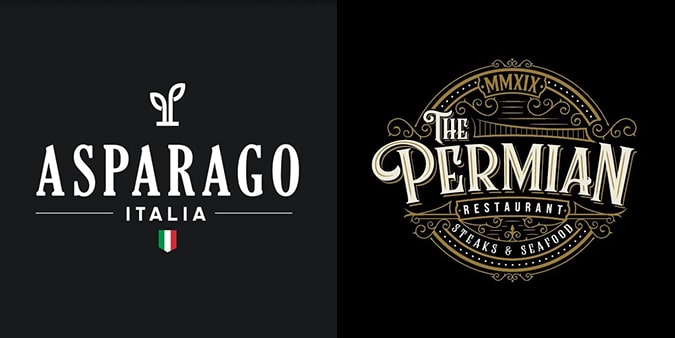
People who dine at upscale establishments like elegant touches and lavish visuals. Your logo needs to match the ambiance of your restaurant to create a memorable fine-dining experience.
Your best bet is to go for nostalgic and hand-drawn designs. They convey a message of precision, romance, and sentimental intentions. You can choose a minimalistic style, or add as many details as you’d like. It’s all up to you.
Contemporary Casual
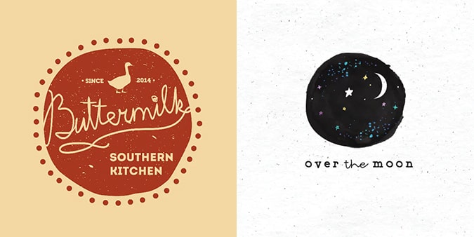
Casual diners are there for the everyday person. Some people just want a cup of coffee, while others go there every Friday night with their friends. Your logo should convey the message that they’re welcome to return at any time. Customers of a casual eatery get highly influenced by fonts, graphics, and colors in your design.
Traditional Establishments
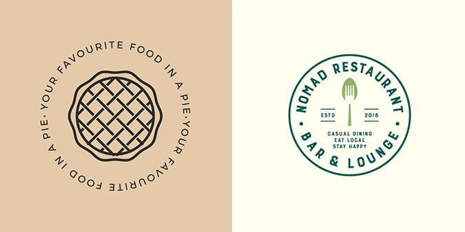
Traditional restaurants often go for a familiar and historic look. Think of all the Italian Restaurants that promote “mama’s pizza.” For this type of establishment, you can go for a more simple font, with added vintage graphics to show the traditional dishes you serve.
Fast-food and takeout
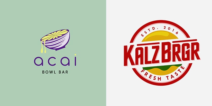
While customers often do not spend much time here, it’s essential that you do attract them on a continuous basis. You need to capture the feeling of satisfaction with the use of graphics that convey the emotions you wish your customers to feel. Make them aware that they will walk away with a fulfilling and delicious meal.
Pubs and bars
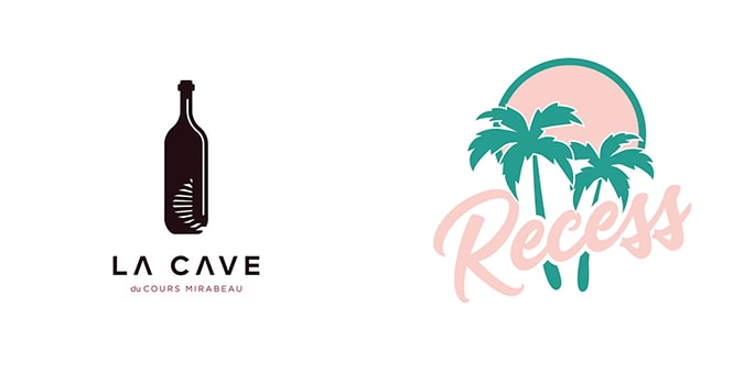
People who often visit pubs and bars tend to linger around for a while. Therefore, you need to capture the atmosphere of your restaurant in its logo. It needs to be true to its nature. Will your guests sit under industrial-chic lightning? Or will they find themselves in a traditional Irish pub? Depending on your audience, you need to use softer fonts and white spaces for a quieter place and robust designs for a more traditional venue.
The basis of a restaurant logo
It can be intimidating to start working on a logo for your eatery. However, we’ve put together a small guide to help you on your way. Logo design is a specific specialization in the graphic design industry that contains not only marketing but also the full aesthetic of a company. Here is how to get started.
Design your trademark
There is not one ideal type of logo. When you look at it, the most successful ones are the ones that represent their brand. I’m sure you will instantly recognize a brand like Coca-Cola by its bright red color and bold typeface. On the other hand, these colors and fonts will not suit a massage studio. You need to find something that matches your niche.
Therefore, it’s essential that you know your brand identity. What is the kind of establishment that you’re running? Where do you put your focus on? The character you create will guide the choices you make in the future.
Know the psychology behind colors, shapes, and fonts
Every color, shape, font, and their combination carries a different meaning. Entirely black trademarks seem powerful and sophisticated, while an orange logo with circles conveys a message of friendliness and energy. The same goes for typography. Sans-serif fonts are casual while serifs get used in more formal settings.
How to get a food restaurant logo design
There are multiple options to find a logo for your restaurant. We’ve listed a few options below:
- Use a logo maker. There are plenty of logo makers online, or software that’s easy to use for beginners. With those programs, you can make your logo yourself from scratch.
- Hire a professional. You can find a professional that works for themselves or through an agency. These professionals have a ton of experience and can provide you with great results, as Eztuto Studio does. However, they are often a bit pricier.
- Choose a freelancer. There are freelancers of all kinds of expertise levels. You can find them online and through websites like Fiverr. They are often cheaper, but you need to make sure to read their reviews before ordering a logo design.
- Host a design contest. If you have already established yourself as a well-known restaurant, you can host a design contest. That way, people can enter their designs, and only the winner will receive a price. Do make sure that you put the specific information and requirements in the contest guidelines.
When you want to use a logo maker, please only do so when you’re short on money. Logo makers are conventional, but they do not provide you with the best designs, and a logo is too vital for branding to skimp on. Considering the time and money that goes into designing a logo by a professional, it may not be as effective if you choose cost over quality.
A logo design contest, on the other hand, is ideal for if you’re not sure yet about the style, you want to add to your establishment. Different professionals deliver different results. At the end of the contest, you’ll have a better view of what you want to add to your restaurant.
When you are sure of the type of design you want, you should choose an agency or freelancer to work with. They can provide you with the best (and sometimes even fastest) results. Browse the internet for portfolios and pick the one you think is best for your eatery.
Ready to go?
Cooking is a form of art, but branding and designing are too. Get creative and make sure you take the time to develop the perfect restaurant logo design that suits your personality and dishes. We hope this article has inspired you to explore the world of graphic design!


