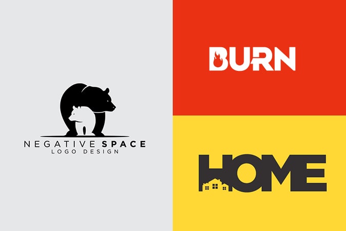
We’ve all seen a logo in which the design looks simple at first, but where a closer look soon reveals that a negative space logo has a proper use too. It won’t be self-evident at first, but logos like this can add depth and create a new message towards your audience just by using the area around the design.
Sometimes, designers focus on the logo itself and ignore the space around it, which is then left unused. However, if you use this empty area, you can establish stable communication between you and your audience on a subtle level.
Using negative space graphic design has plenty of evident advantages. One example of this is a better composition and added layer, which makes the design more straightforward and more effective. Before you start, you need to make sure you understand the basics behind smart negative space usage.
Table of Contents
What is Negative Space?
The blank or empty space around a logo design or illustrated object is the “negative space.” This space helps to define the primary purpose. In short: it’s unused space. However, negative space barely doesn’t get used as it plays an essential role in the composition of all the elements. If there are too many elements in one design and too little space, it will look cluttered, confusing, or lose its meaning. If there’s too much negative space, the composition may seem empty and uninteresting.
Negative space often gets used in taking advantage of an existing subject to create more meaning or optical illusions in combination with pictorial marks or words.
Why You Should Use it in Logo Design
Not all situations may be in favor of using negative space, but there are plenty of benefits you should keep in mind when creating a brand.
First and foremost, it highlights your creativity. The usage of negative space requires balance and creativity. When done well, your effort quickly pays off when your audience enjoys the whimsical look of your design. A youthful design helps to bring out your companies message that you have the ability to think outside the box.
Secondly, your logo stays simple. Rather than adding more and more elements and characteristics, negative space graphic design allows you to work with what you already have. This perk prevents your design from becoming too cluttered and will keep it unique.
Thirdly, your design is memorable. You want your audience to remember you, and what’s a better way than to create a bright and famous logo? When you find a creative use for your empty area, it will make people think. And when people take the time to think, they will be more likely to remember something.
To add to that, you can engage your customers with a creative logo. Using your empty area properly can create an “optical illusion,” which invites your audience to stop and try to find out what’s happening. People love engagement, and thus will be more likely to visit your store or website.
Lastly, it can make your logo stand out. Using negative space gives your logo a unique twist, which sets it apart from the rest. By adding creative characteristics and by using your resources in a new manner, you can separate your brand from the rest of your niche.
Types of Negative Space
There are various types of negative space, each of which offers you a new benefit or unique twist to your design. Whichever suits you best depends on the needs of your trademark and the type of brand you are designing.
- Double Entendres. These logos combine positive and negative space to create a negative space illustration. The result of this is that the end product looks like an optical illusion; it’s understandable in two different ways.
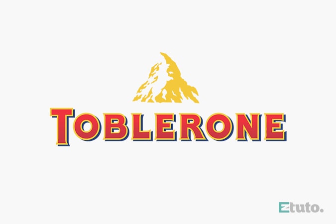
- Hidden Images. Some designs use empty areas to their advantage to hide a relevant image, which adds meaning to the brand. It takes a bit of effort from the audience, but the rewards are significant. Take a look at Toblerone, for example. They have hidden a bear in their famous mountain logo to commemorate Bern, the home base of the company.

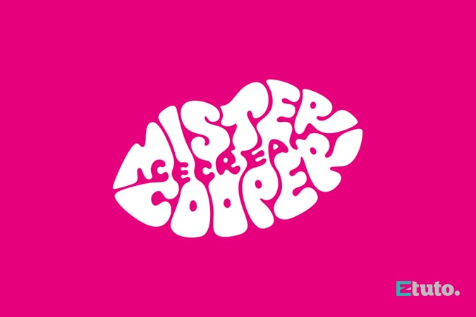
- Typography. Sometimes, space provides an ideal border to use different words and letters. The Mister Cooper Ice Cream does this. They have hidden the term “ice cream” into the lip-shaped typography of their company.

- Closure. You can also use negative space to create a border around your trademark to make it seem like a full image without cramming the design. To give a visual example: the panda in WWF’s logo creates a closure.
The Best Tips for Using Negative Space in Your Design
Learn to embrace the negative space. When you’re focused on the positive area of your design, it’s easy to forget about the empty fields around it. Therefore, it’s essential to think of how you’re using your negative space as it will make it easier to reduce the number of items in your design without harming the product.
Subtract to add negative space. Many designers face the issue of having to deal with limited space while keeping the needs of the positive and negative space in mind. After a first draft, you may find yourself with a lot of positive areas but little to no negative space. Try to look for parts of your design, which you can switch out to negative space. It will remove the clutter and restore the balance.
Add it to your plans. Rather than having to add negative space after your draft, you can also incorporate it into your design ideas. This way, you can plan and remove any potential obstacles you may face. It will also make your logo look more organic and remove the possible clutter that may occur.
Think out of the box. If your design is generic or conservative, negative space will only add to that thought. Be bold and brave, and add your unique ideas to your brand. If you’re looking to produce something creative, your brand will quickly stand out, and your empty areas will highlight your creativity.
Find out the best way to use negative space. Every logo has its own unique needs and characteristics. Therefore, trying to add an element that doesn’t suit your style will hurt your company in the long run. Try to focus on the intention of your trademark and find a suitable empty area to incorporate with that. Your brand may not be a match for a double entendre, but it might be a good fit for a hidden image!
Conclusion
Negative space is a component not many companies use when designing their logo. It helps to add a unique and creative touch to your work and will help your brand stand out from the rest. Innovative usage of this space will also enhance your companies views and attract new customers.
Focus on the negative space from the beginning to make the creation process go smoother and to engage with your audience.
If you don’t feel like creating a negative space logo yourself, you can always hire a professional to do it for you. Eztuto Studio has experienced graphic designers who will be more than happy to help create the perfect logo with creative use of the negative spaces for you!


