Are you looking for a fitness logo design? Whether you’re a gym owner, bodybuilder, personal trainer, or professional athlete, you know you have to work to keep your muscles. The same applies when trying to generate a stable customer base for your company. The right logo is the muscles to your brain, the show stoppers, and the attention generators.
A logo needs to stand out, and it needs to be able to be displayed everywhere from magazine covers to social media. Using a sports or gym logo makes it much easier for you. It allows you to focus on your company, rather than on designing the trademark.
Table of Contents
The secret behind a good workout logo
Since there is a growing amount of exercises to choose from, you can’t add them all into your logo. Your logo shows what kind of business you are and what kind of services you offer. Therefore, it’s essential to pick a design that shows who you are and what you have to offer.
What’s your niche?
Is there something that makes you stand out? If you want to attract customers, you need to find a niche. Perhaps you offer BMX classes, or maybe you’re open 24/7. Other niches can be a personal training service at your gym or different types of classes.
When designing a fitness logo, it should show what you offer. It should also be an invitation to come and check you out. Most beginners are anxious at first, but if you can make them feel accepted, make them feel at home, you are one step ahead already. The more people know about you, the more likely they are to visit.
If you intend to attract the heavy-weight bodybuilders, you may want to go for an intimidating logo. If you prefer to work with the regular public, a friendly and inviting logo will be better. Your trademark should reflect what kind of people you want to see in your gym. If you are a gym specifically for kids, you should consider a colorful logo, rather than black.
Stand out
There is no shame in looking for inspiration online for famous brands. On the contrary, it’s an excellent idea. Think of your cities most popular gym, fitness apps, or even fitness brands. Of course, when it’s time to design a trademark, you should be unique. Being unique prevents confusion or the idea that you’re trying to copycat a famous brand.
Don’t just look at their trademarks, but also have a look at their set-ups. What kind of font do they use? Are there specific colors? If yes, what do you think they mean? A logo is never without meaning, so take the time to dig deeper and find out what it is that attracts customers.
The font and colors you use should also reflect your personality. If you are a gym for tough bodybuilders, then comic sans might not be the best font type to use.
When it comes to picking an image, choose one that reflects the activities you want to focus on like halters, or a yoga pose. You can, of course, also pick a more traditional image like the ones below:
- silhouettes performing an activity (diving, running, fighting)
- weights, kettlebells
- muscles, or more often, a buff arm showing off its biceps and triceps
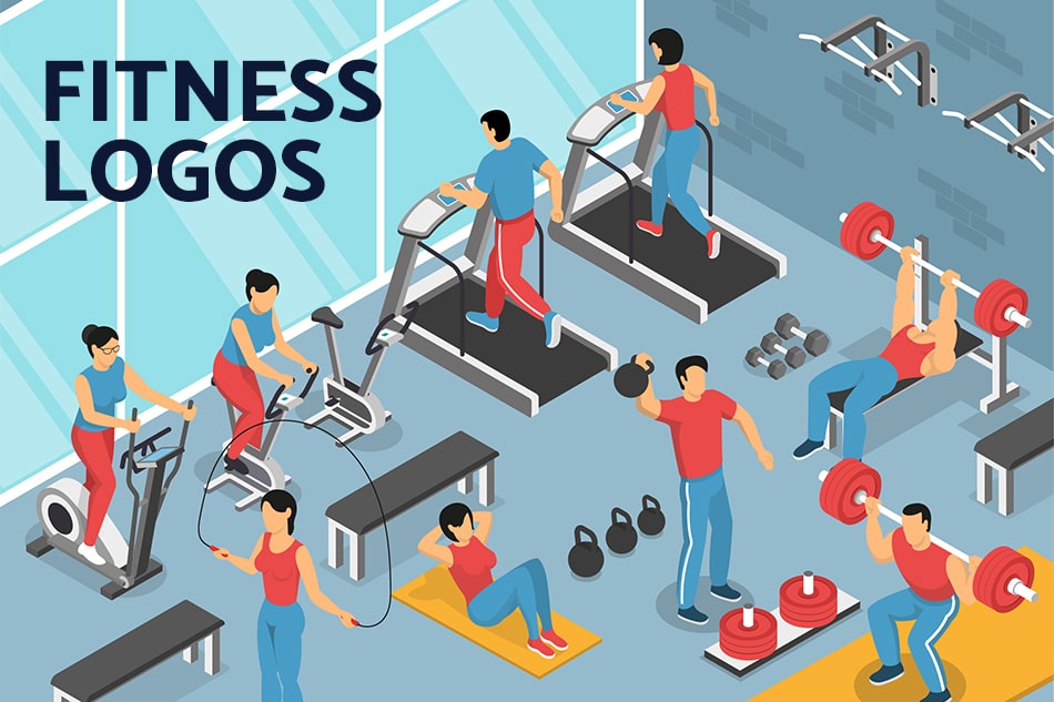
- diverse exercise equipment like a rowing machine, treadmill, cross-trainer
While these images are more common than others, they are recognizable, which makes it easier for your potential clients to see what you have to offer. Even more common images can be unique with the right combination of colors, fonts, and presentation.
Pick the right color for your fitness logo
Colors are essential for your brand, especially since there is proof that colors send reinforcing messages to your brain. Your brain then decides whether it likes or dislikes the color. Therefore, you should always pick positive and robust colors.
Here are a few of the most used colors and their associations:
Black shows authority, boldness, and strength. It’s perfect if you want to teach people these qualities, like boxing.
White stands for purity and cleanliness. If you want to show the world your gym is the purest, cleanest in town, you should use this color.
Blue stands for security and confidence. Brands that use blue are also often trusted. This association may be why police uniforms are usually blue. The implied trustworthiness makes the color ideal to use in a gym that specializes in personal training or promises weight loss.
Green, yellow, and orange are natural colors. They are calming and show positivity. Use these colors in gyms that offer a more relaxed and holistic approach.
Lastly, pink is a feminine and youthful color. It’s full of energy. Use this color in a gym focused on kids or a women-only gym.
You can also choose to pick a color combination like black and blue to promote security and strength. Pick the colors that suit your gym and your intentions best.
Make it fit everywhere
Logos aren’t there for fun. They have a job to do, which is attracting customers. To do so, you need to be able to print your trademark on any possible item. Because of this, not only you should make sure that your design can get cropped, but enlarged or stretched without losing quality. To try it out, design an image that fits both a small sticker and a billboard on time square.
You also need to check your file attributes and make sure that your gym logo can easily get added to any website or flyer. The best way to do this is to create a transparent background and to make it a vector file. This file allows for a smooth transition on any surface, whether they are billboards, TV’s or T-shirts. Your merchandise is your biggest advertiser.
Don’t complicate it
Yeah, it’s great to have a unique brand, but it should be simple too. Most of the best fitness logos we know are incredibly simple. Just look at Apple, Nike, or Adidas. Their design tells you their story, are unique but can be recognized worldwide. Find the right balance for you. It doesn’t need to be as simple as Nike, but don’t make it too complicated either.
To check whether your trademark is too simple or too complicated, shrink it. If your logo still looks excellent and recognizable in a tiny size, it’s probably well designed. If it still gets the message across to your potential customer, you have succeeded!
How to pick the right design
Making a logo yourself can be hard, especially if you’re not too tech-savvy. However, we can make the perfect design for you at Eztuto Studio. All you have to do so we can do the job for you is to provide us with some information on your business. Our team will then create a perfect trademark for you. After a few days, the group presents you with multiple options to choose from. You can then select one or ask for alterations to the one you like most. We’ll be happy to help!
If you are content with the design we presented to you, we will offer the finalized plan in multiple formats. Each format’s design perfectly suits any potential platform you may want to post your trademark. Think of websites, prints, merchandise, ads in magazines or on TV, and much more. We will also save your design so that if you ever happen to lose it, we can send you the file without any issues. The best thing is, it’s quick, easy, and cheap since you don’t have to spend time working on the fitness logo design yourself.

