We need to drink every day. That’s why drink logo design is so important. Some people enjoy a soda every day, while others prefer coffee, kombucha, juice, or a beer with their friends. We see beverage logos every day, the whole day, even when we’re unaware of it. Some, however, we remember. They stand out more than others.
A memorable and creative logo is essential to growing a successful brand. Strong drinks logos help to connect to (potential) customers. These trademarks tell a story and convince your audience to choose you rather than your competitor. We’ve collected a few inspiring logos for you to have a look at!
Table of Contents
How do you design a good drink brand?
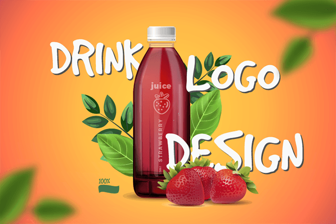
Like food, drinks need logos too. They need to call to your appetite and evoke positive feelings and emotions. When you create such a trademark, you need to make sure to use inviting images and colors to draw in your audience. However, these colors and pictures have a function. They need to stand for the contents and flavors of your drinks, like fresh, green leaves for an Iced Tea, or a juicy orange for your fresh orange juice.
Want an awesome logo design?
Work with our team to create a drink logo today!
Your trademark needs to convey a more meaningful message than just the contents of your drink. Your logo is an extension of your brand identity and brand voice. It needs to speak on your behalf, so choose one wisely and pay attention to every single detail.
A high-quality trademark is a timeless one and can last for ages. You want your audience to build a long-term relationship with this beverage and to evoke a feeling of nostalgia and familiarity when they see your brand. You need to be memorable and recognizable between the plethora of competitors in the supermarket or cafés. However, you should also be able to adapt to whatever choices your brand might make in the future.
Creative ideas for drinks logo
Natural and Organic logos
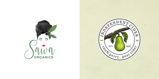
Times are changing, and we’re continually looking for ways to improve our consumption. The first cue we get whether or not a brand is natural is from the logo.
When you want to show the world that your brand is organic and natural, you should pick a natural-looking design scheme with natural and fresh colors — using realistic images of produce and trees. These work well for a natural brand, just like images of the sun, happy animals, flowers, or plants. Make sure to pick a logo that combines well with a clear container.
Go for a minimal and handmade look as a finishing touch. Logos like these are perfect for healthy drinks, juices, and no-sweetener teas. It will look like it nurtures your body, and that’s what your customers are looking for!
Vintage drink designs
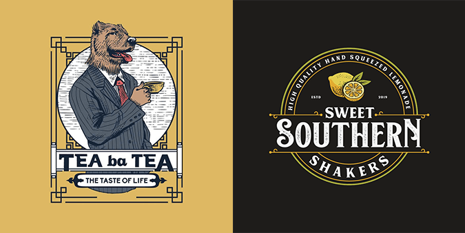
Some drinks are older than others. Beer, coffee, wine, and whiskey are some of the most popular of these drinks. They are universal and will last forever in this continually changing world.
When you want to use this familiarity to your advantage and to evoke feelings of nostalgia, then a rustic and vintage design is ideal for you. Warm brown tones combined with hand-drawn illustrations complete the vintage picture. They make it seem artisanal, exactly how you like your gin or tea.
When it comes to the typeface, pick a rugged and bold design, like a combination of serif with a sans-serif font. These fonts make your design look confident and sturdy.
Fun designs for creative beverages
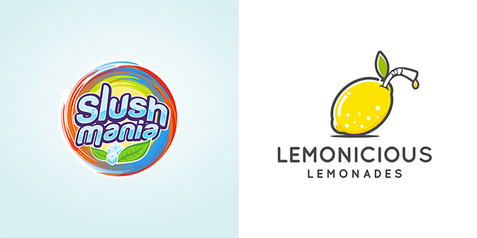
We have foods that make us happy, like icecream, chocolate, sugary doughnuts, or a big pizza. However, we also need uplifting drinks in our lives. You want to get a boost from just looking at such a bubbly-looking drink!
Sparkling juices, energy drinks, and kid’s beverages often benefit from a fun logo. They contain many vibrant colors, bold and popping text with curves and soft edges, and are usually a bit silly too.
Still, you need to make a distinction between the audience of the drinks. A kid’s beverage may contain a cartoon image of an animal or character from their favorite TV-show, while an energy drink uses a lion. Pick something that appeals to your audience.
Elegant logos
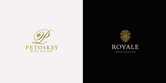
High-end liquors, champagne, cava, and wine often opt for elegance, rather than popping logos. However, they don’t need to be limited to alcoholic drinks only. You’re selling a lifestyle, a feeling of fanciness. You connect to people who want to treat themselves, and who want to feel sophisticated.
Clean lines, sophisticated illustrations, and vibrant colors and textures are perfect for evoking these feelings. Black, gold, burgundy tones, and velvety textures give you a nudge in the right direction. Choose bold texts with elegant typefaces.
What goes into a logo design
Before you start designing your drink logo design, you should have at least a bit of basic knowledge about them. If this is your first attempt, you should know that it’s completely normal to feel intimidated by the task. We’ll give you a few tips to cover the basics of logo design.
Logo design contains all kinds of characteristics, like branding & marketing, typography, creativity, color theory, and aesthetics. A logo works best when it fully represents your brand, the colorful and youthful Fanta design won’t work for a glass of high-end champagne. See your logo as an invitation to your party, who do you want to come?
So, before you get creative, you need to think about the kind of brand you want to be. What’s your brand identity? Do you plan on selling herbal teas, or fast-paced energy drinks? These decisions guide the choices you make, especially your colors, shapes, and text.
Each color and shape has a different meaning and conveys mixed emotions. Logos that use much black will come across as sophisticated and robust, while an orange color seems rather youthful. Serif fonts go well with fancy-looking designs, while a sans-serif is casual. Every decision you make reflects your brand identity, so be careful.
Ways to get a drink logo design
There are plenty of ways to find or create a trademark for your company. Here are four of the main options you can choose from:
- Create your logo. Rather than hiring someone to do it for you, you can also design your logo. A big perk of this is that you have all the creative freedom you can think of. A downside to this is that you may not be fully aware of the right color combinations and layout. When you choose a logo maker, you are also limited to the options it has for you. However, this option is the cheapest, so it’s ideal if you have a low budget.
- Hire a freelancer. A freelancer can range from an amateur designer to a professional graphic designer. Websites like Fiverr offer a vast range of freelancers for you. A freelancer can work with your wishes and often has close contact with you. However, make sure always to read their reviews as some freelancers are not as good as they make you think.
- Work with an agency. This option may be the most expensive, but it provides the best results. An agency works with professional and vetted designers and can provide you with the best logo designs you could wish for. Every agency handles their specific prices, so pick one that suits you best.
- Host a contest. While this option takes longer than the others, it opens up a doorway to creative input from all kinds of people. When you host a match, both professionals and hobbyists can sign up and deliver their take on your logo design. In the end, you only have to pay for the one you choose.
Get ready to design!
You want your drink logo design to stand out from the rest. Using our tips and inspirational designs, you can create a unique and exciting trademark to gain a large customer base. However, make sure that you are assured of your brand identity and the type of customers you want to invite. Good luck!

